

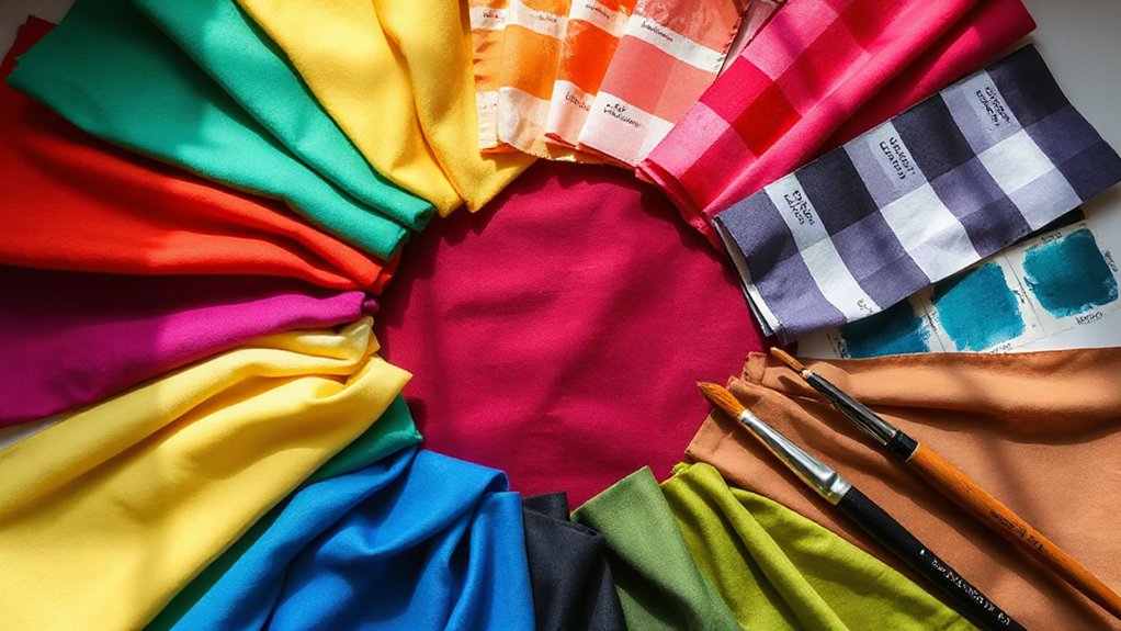
You’ll build a cohesive multi-colour palette by starting with one anchor colour you’ve tested in real lighting and materials, then defining each colour’s job (background, surface, text, border, CTA, alerts). Pick 3–5 hues using a simple colour-wheel scheme, create tints and shades, and keep saturation in a consistent band so nothing competes. Apply 60–30–10 for balance, check WCAG contrast across states, and save everything as role-based tokens. Keep going to see step-by-step examples and fixes.
Key Takeaways
- Start with one anchor colour you’ve tested in real lighting, and document exact specs (HEX/RGB/CMYK/Pantone) for consistency.
- Define the palette’s purpose and rules: accessibility contrast targets, fixed brand colours, and clear roles for background, text, and accents.
- Choose a simple colour-wheel scheme (analogous, complementary, split-complementary, or triadic) and limit the core palette to 3–5 colours.
- Build usable tints and shades for each hue, then test light-on-dark and dark-on-light pairings to confirm readable contrast.
- Apply the 60–30–10 balance rule, keep most areas neutral, and reserve vivid saturation for small, high-priority elements like CTAs.
Start With One Anchor Colour You Trust
If you start with one anchor colour you already know works, you’ll make every other palette decision faster and far less risky. Pick a colour you’ve tested in your context: a brand primary, a room paint sample, or a hero image tone. Confirm it in real lighting and on the final material (screen, print, fabric), not just in a picker.
Next, document its specs (HEX/RGB/CMYK/Pantone) and build guardrails. Use Color psychology to note the emotional signal it sends (calm, urgent, premium), then check Cultural associations that could change meaning across audiences.
Create two to three tonal variants (tint, mid, shade) so you can handle backgrounds, accents, and text without guessing. That anchor keeps everything coherent.
Define the Palette’s Job Before Picking Colours
Before you add a second swatch, decide what the palette must *do* in its real setting: guide attention, communicate a mood, meet accessibility standards, and stay consistent across surfaces like screens, print, and paint.
Define primary tasks: headers must pop, CTAs must read instantly, and background colours must recede.
Use Color psychology deliberately—calm hues for wellness, high-energy accents for promotions—so emotion supports function.
Lock in branding consistency by listing fixed elements (logo colours, product tones, photo filters) you won’t change.
Then set constraints: minimum contrast ratios, max number of accent colours, and where each colour can appear (UI states, packaging panels, room zones).
You’ll choose faster and avoid mismatched, hard-to-use combinations later.
Build Your Palette From a Colour Wheel Scheme
Start by choosing one base hue that matches the palette’s job, then use it as your anchor for every other pick.
Next, select a colour wheel scheme—analogous for calm, complementary for punch, or triadic for variety—so your choices follow a clear structure.
Finally, balance the palette by adding tints and shades of those hues to control contrast and keep the full set cohesive.
Choose A Base Hue
Once you’ve decided on the mood you want, choose one base hue to anchor the entire palette—this is the colour you’ll use most often and the one everything else should support. Pick it from your key element: a logo, hero image, statement sofa, or primary garment.
Test two to three candidates in context, not in isolation, and commit to the one that stays stable under different lighting and screens.
Use Color psychology to sanity-check your choice: blues read calm, reds feel urgent, greens signal growth. Then review cultural associations for your audience—white can mean purity or mourning, and red can suggest luck or danger.
Finally, define your base hue’s value and saturation so you can repeat it consistently across materials and finishes.
Select A Wheel Scheme
Next, pick a colour-wheel scheme to turn your base hue into a coherent set of supporting colours you can repeat without guesswork. Start with a simple option: monochromatic (one hue), analogous (neighbors), complementary (opposites), split-complementary (one opposite plus its neighbors), or triadic (three evenly spaced).
Choose based on how much contrast you need: analogous feels calm and unified, complementary looks bold and energetic, triadic stays lively but balanced. Use Color psychology to match intent—blue for trust, red for urgency, green for freshness—then check cultural symbolism so meanings don’t backfire across audiences.
Limit your selection to 3–5 colours from the scheme, and assign roles: primary, secondary, accent, and background to keep decisions consistent.
Balance Tints And Shades
After you’ve chosen a wheel scheme, balance tints (hue + white) and shades (hue + black) so your colours work across backgrounds, text, and accents without fighting for attention. Start by assigning one midtone per hue as your “true” base, then create a light tint and a deep shade from each. This preserves Hue harmony while expanding usability.
Test legibility: place your darkest shade behind white text, and your lightest tint behind dark text. If contrast fails, push the shade darker or the tint lighter instead of changing the hue.
Use Tint variation for hierarchy—lighter tints for surfaces and cards, midtones for icons, and darkest shades for CTAs and headings. Keep saturation consistent so tints don’t look chalky and shades don’t turn muddy overall.
Use a 60–30–10 Rule for Palette Balance

To keep your multi-colour palette cohesive, you’ll balance it with the 60–30–10 rule: commit about 60% to your primary colour share so the overall look feels anchored.
Then assign roughly 30% to a secondary colour that supports the main hue across key areas without competing for attention.
Finish with a 10% accent colour pop in small, high-impact spots to add contrast and energy.
Define Primary Colour Share
Once you’ve picked the colours you want to use, decide how much visual “real estate” each one gets so the palette feels intentional instead of chaotic. Your primary colour should claim about 60% of the design, anchoring pages, screens, or rooms and creating instant recognition.
Choose the hue that best supports your brand identity and matches your message through Color psychology (calm blues, energetic reds, grounded neutrals). Apply it to the largest surfaces: backgrounds, main blocks, key panels, and dominant shapes.
Keep saturation and brightness consistent across uses so it reads as one “main” colour, not several similar ones. Test it at different sizes and lighting, and check contrast against text and core UI elements to guarantee clarity and accessibility.
Assign Secondary Colour Support
While your primary colour does the heavy lifting, your secondary colour should cover roughly 30% of the design to add structure and variety without competing for attention. Use it for large supporting areas like sidebars, header bands, secondary backgrounds, and non-primary buttons.
Pick a hue that relates to your main tone through undertone or temperature so the palette stays cohesive. If you want clearer contrast, try a Complementary pairing, then soften it by lowering saturation or shifting it toward a tint or shade.
Let colour psychology guide the job: calming blues can support bold warm primaries, while grounded neutrals can stabilise energetic brights.
Test the 60–30 balance in a quick mockup, then adjust until hierarchy reads instantly across screens and print.
Add Accent Colour Pop
Where should you add that “wow” moment without blowing up your hierarchy? Use the 60–30–10 rule: 60% dominant base, 30% secondary support, and 10% Accent colour.
Keep that 10% intentional so it reads as emphasis, not noise.
Apply your accent to high-value touchpoints: primary buttons, active states, key icons, price tags, or section headers. Limit it to one hue (or one hue plus a tint) to avoid competing highlights.
For a controlled colour pop, choose a high-contrast accent against your base—either complementary, split-complementary, or a brighter value of your secondary.
Test in grayscale: if the accent still pulls attention, you’ve nailed hierarchy. Then check accessibility contrast for text and UI elements.
Choose Supporting Colours With Clear Roles
Because a multi-colour palette can turn chaotic fast, you’ll get better results by assigning each supporting colour a clear job before you worry about perfect shades.
Pick one “primary support” to back up your base colour in large areas like backgrounds, sections, or major shapes. Then add one or two secondary colours strictly for Supporting accents: buttons, icons, tags, highlights, and small patterns.
If you want Complementary harmony, reserve the complement for high-priority cues (calls to action, alerts, key data points) so it signals importance instead of noise.
Create a quick role list—background, surface, text, border, emphasis—and map each colour to one role only. When you’re tempted to add another colour, assign it a role first—or don’t add it.
Control Saturation So Colours Don’t Fight
Set a saturation range first (for example, keep most colours at 20–60% saturation) so your palette stays cohesive.
Balance muted shades with a few vivid accents, and reserve the most intense colour for one clear focal point.
If a hue still feels too loud, knock it back by pairing it with neutrals like warm grey, cream, or charcoal to calm the overall mix.
Set A Saturation Range
Even if you’ve nailed your hues, you’ll still end up with a chaotic palette if the saturation levels vary too wildly. Set a clear saturation range so every colour feels like it belongs.
Start by choosing a working band, like 25–45% saturation for a calm, cohesive set, or 40–60% for more punch.
Check each swatch in HSL/HSB and nudge saturation until it sits inside your band. Watch Saturation perception: colours look more intense at smaller sizes, on white backgrounds, and next to neutrals.
Control Color intensity by reducing saturation on “loud” hues (reds, magentas) and slightly increasing it on “quiet” hues (blues, olives) to match perceived strength.
Lock the range, then re-test on your real layout and lighting.
Balance Muted And Vivid
Once you’ve locked a saturation band, you still need to decide which colours get to be vivid and which should stay muted so the palette has hierarchy instead of conflict. Pick one “hero” colour to carry attention, then choose one supporting accent if needed; keep the rest quieter.
Aim for a clear Muted vivid contrast: let vivid hues occupy small, intentional areas (buttons, headlines, focal objects) while muted hues cover larger fields (backgrounds, walls, base garments). Check balance by squinting: the vivid areas should read as organized highlights, not scattered noise.
Match saturation to function and Emotional impact—use vivid for energy and urgency, muted for calm and credibility. If two colours compete, reduce one’s saturation or shrink its usage.
Adjust Saturation With Neutrals
When your colours feel like they’re competing, pull saturation back with neutrals so the palette has somewhere to rest. Start by choosing one “anchor neutral” (warm beige, cool gray, off-white, charcoal) and apply it across large areas like backgrounds, walls, or base garments. This establishes neutral saturation and keeps bright hues from overpowering the scene.
Next, tint your loud colours with that same neutral: add 5–15% gray to digital swatches, mix a touch of complementary or black/white in paint, or pick “dusty” versions in fabric. You’ll get subdued vibrancy that still reads colourful but won’t clash.
Finally, reserve full saturation for one focal element and keep the rest at 60–80% intensity for calm contrast.
Adjust Value (Light/Dark) for a Cohesive Palette

How do you make a set of different colours feel like they belong together? You control value: how light or dark each colour sits. Start by converting your palette to grayscale (or squinting) to see the value pattern without hue distraction.
Pick a target structure—mostly light, mostly mid, or mostly dark—then nudge each colour toward that band. For light consistency, raise values by adding white or moving the colour up the value slider until every “light” chip matches in brightness.
For dark harmony, lower values by adding black or deepening the shade until your “dark” chips read equally strong. Keep one or two accent values outside the band, but limit them so contrast stays intentional.
Add Neutrals That Make Your Colours Look Better
Why do your bright colours sometimes look louder than you intended? It’s usually because they’re competing without a visual “rest stop.” Add neutrals to control contrast and give the eye somewhere to land.
Start by choosing one neutral base: warm ivory, cool gray, taupe, or near-black. Use it for subtle backgrounds, large shapes, and negative space so your key colours read as intentional, not chaotic.
Then add Neutral accents—charcoal lines, beige labels, off-white borders, muted metal hardware—to separate hues and improve legibility. Match the neutral’s temperature to your dominant colour family: warm neutrals flatter reds and oranges; cool neutrals calm blues and greens.
Keep neutrals consistent across elements, and limit them to two values so they unify instead of distracting.
Create Tints and Shades to Expand Your Palette
Even if you’ve picked only three or four core colours, you can stretch that set into a cohesive, flexible palette by building tints and shades. Create tints by mixing each hue with white (or increasing lightness in HSL), and create shades by mixing with black or a deep neutral. Start with 10–20% steps so your jumps feel intentional, not random.
Use tint blending to keep undertones consistent: blend toward the same “paper white” and the same dark anchor, rather than pure #FFF or #000 if they clash with your neutrals.
Then assign roles: light tints for backgrounds, mid-tones for fills, deeper shades for emphasis and depth. This structure supports Color harmony because every variation stays related to your core hues.
Check Contrast So Your Palette Stays Readable
Now you’ll measure text-to-background contrast for every key pairing (body text, headings, buttons) so nothing gets lost at a glance.
Next, you’ll test contrast across states—hover, active, disabled, and focus rings—because shifts in shade can quietly break readability.
Finally, you’ll verify accessibility contrast ratios (like WCAG AA/AAA) with a checker and adjust tints, shades, or text colour until every combo passes.
Measure Text-To-Background Contrast
Before you lock in your multi-colour palette, measure text-to-background contrast for every key pairing so your headlines, buttons, and body copy stay readable in real-world use.
Use a contrast checker and test your core combinations: primary text on base background, inverse text on dark fills, and accent text on light surfaces.
Aim for WCAG AA: 4.5:1 for normal text, 3:1 for large text (18pt+ or 14pt bold).
If a pairing fails, don’t guess—darken the text color, lighten the background, or shift saturation until it passes while keeping hue relationships intact.
This protects typography harmony and branding consistency because you won’t rely on “pretty” but illegible pairings.
Document passing ratios in your palette spec for designers and developers.
Test Contrast Across States
Although your default color pairings may pass WCAG, you still need to test contrast across UI states—hover, active/pressed, focus, selected, disabled, visited links, and error/success—to keep text and icons readable when fills and borders shift.
Build a simple state matrix: component, foreground, background, border, and overlay. Then preview every state side-by-side so you can spot drops caused by darkening fills, adding shadows, or swapping strokes.
Use tokens that change predictably (e.g., +10% lightness on hover, +20% on pressed) to preserve Color harmony. Check focus rings and selection fills on both light and dark surfaces.
For disabled states, reduce saturation before reducing opacity to maintain Visual consistency. Finally, test on real content: long labels, icons, and small text.
Verify Accessibility Contrast Ratios
After you’ve reviewed every hover, pressed, and disabled state, validate the palette with measurable contrast ratios so you don’t ship “looks fine” colors that fail in real use. Use a contrast checker and record ratios for text-on-background, icons, focus rings, and data viz marks.
Aim for WCAG AA: 4.5:1 for normal text, 3:1 for large text and UI components; use AAA (7:1) for dense reading screens. If a brand hue won’t pass, keep it as an accent and pair it with a compliant neutral, or shift lightness—not just saturation.
Recheck gradients and overlays at multiple stops. Note how Color symbolism and cultural significance can push you toward certain hues; accessibility still decides final pairings.
Test Your Palette in Real Layouts and Materials
Once your colours look good on a swatch strip, you need to see how they behave in real-world contexts—size, spacing, lighting, and material texture can change everything.
Drop your palette into a few key screens: a hero section, a form, a data chart, and a call-to-action. Test at multiple type sizes and component states (hover, disabled, error) so you catch clashes early.
Print a page and view it under warm and cool light; on paper, some hues dull, and contrast shifts. If you’re designing products or interiors, sample paints or fabrics—matte absorbs light, gloss amplifies saturation.
Check Color psychology: does the emotional impact still match your intent when colours cover large areas? Adjust ratios, not just hex values.
Make Your Palette Work for Colour-Blind Users
Because colour blindness changes how people separate hues, you should stress-test your palette so meaning never depends on colour alone. Run your key colour pairs (status, categories, links, charts) through a colour-vision simulator and check them in grayscale to confirm separation.
Prioritise lightness contrast: choose colours with clearly different luminance, not just different hue. Add non-colour cues everywhere colour carries information—icons, patterns, labels, underlines, and distinct shapes for data points—so your system stays color blind friendly.
Verify text contrast ratios against backgrounds and keep interactive states (hover, focus, disabled) distinguishable with outlines and thickness changes. Document these accessibility considerations in your palette notes so you apply them consistently across components and exports.
Common Palette Mistakes and Quick Fixes
Even if you’ve picked “nice” colours, a palette can still fall apart when you apply it across real UI states, charts, and backgrounds. A common mistake is mismatched contrast: your accent looks great on white, then fails on cards or dark mode—fix it by testing every colour on each surface and nudging lightness, not saturation.
Another is value clustering: several hues share the same brightness, so charts blur—separate them with clear light/dark steps. You might also overuse one loud colour; cap intense accents to small UI moments.
Don’t ignore Color psychology or Cultural meanings: a “success” green can read as warning in some contexts—validate with users and provide neutral alternatives.
Finally, watch for muddy blends in gradients; simplify stops.
Save Your Palette as Reusable Colour Styles
After you’ve fixed contrast and value issues, lock those improvements in by saving your palette as reusable colour styles (or design tokens) instead of ad‑hoc hex codes. Name tokens by role, not hue: `Surface/Primary`, `Text/High`, `Accent/CTA`, `Border/Subtle`.
Add metadata in notes (or a spreadsheet): intended use, contrast pairings, and quick reminders of Color psychology and Cultural symbolism so you don’t misuse red, green, or white across markets.
Create state variants (`CTA/Hover`, `CTA/Disabled`) and semantic aliases (`Success`, `Warning`) that map to base colours. Then apply tokens everywhere—components, illustrations, charts—so updates propagate instantly.
Finally, export styles for your tools (Figma, CSS variables, Tailwind config) and version them, so every revision stays consistent across files and teams.
Frequently Asked Questions
How Do I Name and Document Colours for Client Handoff?
Name colors with clear, scalable tokens (e.g., `brand/primary/500`, `neutral/100`) and avoid vague names like “sky.” Document each color in a handoff sheet: HEX, RGB, CMYK, Pantone (if needed), usage notes, contrast ratios, and do/don’t examples.
Store them in a single source (Figma library + exported JSON/ASE) to enforce Color consistency.
Add a changelog and owner to streamline client communication and approvals.
What File Formats Export Palettes Best for Print and Digital?
Export for print as ASE plus a PDF swatch sheet with CMYK/Lab values and coated/uncoated notes; it preserves palette harmony across vendors.
For digital, share HEX/RGB in CSS variables and export as ACO (Photoshop) or Sketch/Figma library tokens.
Include ICC profiles and a small usage guide tying Color psychology to roles (primary, accent, background).
You’ll avoid mismatched colors and keep consistent intent across mediums.
How Many Colours Can a Brand Palette Include Without Feeling Chaotic?
You can include 5–7 colours without it feeling chaotic. Cram in 20 and your brand looks like a confetti cannon hit a paint factory.
Anchor with 1–2 primaries, add 2–3 supporting tones, and reserve 1–2 accents for sparing highlights.
Apply Color psychology by assigning each colour a role (trust, energy, calm).
Check Cultural significance so meanings don’t clash across markets.
Test in real layouts.
How Often Should I Refresh a Palette Without Hurting Brand Recognition?
Refresh your palette every 2–3 years, or sooner if your market, products, or audience shift. You’ll protect branding consistency by keeping core brand colors stable and only adjusting accents, tints, or saturation.
Use color psychology to validate changes: test whether new tones preserve your desired traits (trust, energy, luxury).
Roll updates gradually across touchpoints, document rules, and A/B test key assets before full rollout carefully.
What Tools Help Generate Palettes From Photos or Existing Artwork?
Roughly 1 in 12 men has some form of color vision deficiency, so you’ll want tools that support Palette accessibility.
You can use Adobe Color to extract swatches from images and check Color harmony rules instantly.
Try Coolors or Canva’s palette generator for quick photo-based palettes.
For artwork, use Affinity or Photoshop’s eyedropper plus libraries.
Then validate contrast with WebAIM or Stark to keep your palette usable.
Conclusion
Now you’ve got a repeatable way to build a cohesive multi-colour palette: start with a trusted anchor, pick a scheme, assign clear roles, and balance it with 60–30–10. Before you ship, test it in real layouts, check colour-blind contrast, and save it as styles. For example, when you redesign a bakery’s site, you keep warm terracotta as the anchor, add cream for backgrounds, sage for accents, and navy for text—then confirm readability on menus.