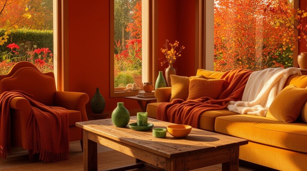
Swap gray for a warm neutral base you can live with: creamy white, soft beige, or light terracotta on walls, a main rug, and big upholstery. Then layer affordable warmth—caramel throws, olive pillows, jute or warm flatweave rugs, and brushed brass (even spray-painted) hardware. Use 2700K–3000K bulbs so everything stays cozy, not yellow. Add depth with walnut or espresso accents repeated a few times, and you’ll get a brighter, richer look—next up are easy room-by-room combos.
Key Takeaways
- Start with a warm neutral base on walls and large pieces—creamy white, soft beige, muted ochre, or light terracotta—to avoid a gray, flat feel.
- Replace gray textiles with oatmeal linen curtains, jute or warm flatweave rugs, and camel or caramel throws to instantly warm the room.
- Use proven palettes like cream+camel+rust, sand+olive+brass, or linen+terracotta+walnut, repeating each color across pillows, art, and one throw.
- Add depth with warm dark accents—walnut, espresso, oxblood, or warm charcoal—repeated in frames, hardware, and lamp bases for contrast.
- Set lighting to 2700K–3000K and test paint in day and lamp light, so warm tones stay cozy without turning yellow.
Pick a Warm Color Scheme Baseline
If your space feels flat because everything leans gray, start by choosing a warm baseline that you can repeat across the room. Pick one dependable undertone—creamy white, soft beige, muted ochre, or light terracotta—and use it on the largest surfaces first: walls, main rug, and big upholstery.
Color psychology matters: warm neutrals read welcoming and help skin tones and wood finishes look healthier under evening light. Check paint chips in morning and lamp light, then commit to one finish level for consistency.
Let historical influences guide you: look at plaster, linen, and clay palettes from older homes and classic travel photos.
Save money by repainting trims only if they clash, and re-cover pillows last.
Warm Color Schemes That Replace Gray
Once you’ve locked in a warm baseline, swap the rest of the gray-heavy pieces for a simple warm scheme you can repeat on purpose: think cream + camel + rust, sand + olive + brass, or linen + terracotta + walnut.
Use Color psychology to guide your swaps: creams calm, olives ground, and rusts energize without shouting. Replace gray curtains with oatmeal linen, gray rugs with jute or warm flatweave, and chrome hardware with brushed brass spray-painted for less.
Keep walls neutral, then echo your trio in three places: pillows, an art print, and one throw.
Lean on Historical influences—Mediterranean terracottas, Arts-and-Crafts olive, and midcentury walnut—to make the palette feel intentional.
Shop secondhand wood pieces and refinish to match.
Cream + Caramel for Soft, Sunny Rooms
Start with a creamy base on walls and key upholstery to keep the room bright. Then add caramel through a couple of budget-friendly swaps like pillows, a throw, or a simple rug.
You’ll get the most impact by layering tones (ivory, oat, sand) and repeating caramel in small hits so it looks intentional, not busy.
Finish with texture—linen, boucle, warm wood, or woven baskets—to add depth without adding more colors or spending much.
Layering Creamy Neutrals
While cool grays can make a room feel flat, layering creamy neutrals brings back warmth without turning the space yellow. Start with a soft cream on walls (matte hides flaws), then add slightly deeper off-whites on trim or built-ins for subtle contrast.
Use Color psychology to your advantage: creamy tones read calm and welcoming, so they work well in bedrooms, living rooms, and hallways where you want stress to drop fast.
Test two to three paint swatches in morning and evening light, because Seasonal variations change how cream reads—winter light can look cooler, summer light can skew warmer.
Save money by keeping existing flooring and swapping only lamp shades and light bulbs to 2700–3000K for consistent warmth.
Caramel Accents And Texture
If you like the calm of cream but need more dimension, caramel accents add a soft, sunny glow without pushing your room into orange territory. Start small: swap in a caramel throw, woven basket, or lampshade, then repeat the tone twice more so it looks intentional. Choose Caramel accent accessories in matte finishes to keep the palette relaxed and hide wear on a budget.
To avoid flat walls, try Textured wall finishes instead of pricier art. A limewash-look paint, subtle sand additive, or peel-and-stick grasscloth gives depth while staying in the cream family. Keep trim and ceilings a cleaner cream for contrast, and anchor the scheme with warm wood or tan rugs.
Use warm LEDs (2700K) so caramel reads rich, not yellow.
Terracotta + Blush for Cozy, Modern Warmth
Because terracotta brings earthy depth and blush adds a soft lift, this pairing warms up a space without drifting into beige or gray. Use it as a complementary color pairing: terracotta anchors large pieces (rug, sofa throw, painted dresser), while blush stays lighter on walls, bedding, or art mats so the room feels bright.
Keep costs down by swapping textiles first—pillows, curtains, and a table runner—then add one painted accent if you still want more color. Build polish with textural contrast techniques: pair matte terracotta ceramics with a bouclé blush pillow, linen drapes, and a warm wood side table.
Balance with off-white trim and simple black hardware to sharpen edges without cooling the palette. Add layered lighting for depth at night.
Sand + Clay for an Earthy Neutral Palette

Pair sand as your light base (walls, rugs, or linen) and use clay in smaller hits—pillows, pottery, or an accent chair—so the room stays warm without turning muddy.
Keep the balance by repeating each tone at least twice and spacing them across the room, which costs less than a full repaint when you want to tweak it.
Layer earthy neutral textures like jute, matte ceramics, raw wood, and brushed metal to add depth while staying within an affordable, easy-to-find palette.
Balancing Sand And Clay
While bright whites and cool grays can feel stark, a sand-and-clay palette gives you a warmer neutral base that still reads clean and modern. Start with sand as your dominant wall color; it’s forgiving under mixed bulbs and costs no more than standard beige.
Bring in clay through one focal surface—an accent wall, cabinetry, or a rug—so the room doesn’t skew orange. Aim for a 70/30 split: sand for breadth, clay for depth. Keep undertones aligned by sampling in daylight and lamplight before you buy gallons.
If you’re adding greenery, treat color like soil composition: too much clay overwhelms, but the right balance supports plant health visually, letting leaves look fresher and more vibrant. Use matte paint to hide flaws.
Layering Earthy Neutral Textures
If you want your sand-and-clay palette to feel intentional (not flat), layer textures the same way you’d layer light. Start with your largest surfaces: add Textured wall finishes like limewash, skim-coat plaster, or even a matte, sand-additive paint in one accent zone. Keep it subtle so the clay tone still reads warm, not busy.
Next, build depth with Layered fabric patterns. Mix a tight weave (cotton canvas sofa slipcover) with a nubby weave (bouclé pillow), then add one low-cost printed element (block-print lumbar or striped throw) in the same hue family.
Anchor the floor with a natural-fiber rug and stack a smaller flatweave on top for contrast. Finish with unfinished wood, ceramic, and woven baskets instead of shiny metal.
Warm White + Olive for Relaxed Elegance
Because gray can read cold and flat in everyday light, warm white walls give you a cleaner, brighter base without looking sterile. Olive adds depth that feels calm instead of trendy. Use Color psychology and interior design principles: warm white keeps spaces open and reflective, while olive signals rest and stability.
To stay budget-smart, paint first, then add olive through pillows, a thrifted wool throw, or an easy-to-clean rug. Pick one olive “anchor” piece—an accent chair, curtains, or lower cabinets—so you don’t overbuy.
Balance undertones: choose a creamy white (not blue) and an olive with a muted, dusty cast. Finish with warm metals and natural wood to prevent the scheme from feeling too sharp.
Camel + Rust for Rich, Grounded Color
Even when you want color that feels substantial, camel and rust deliver warmth without making a room look dark or dated. Use this color pairing when you want cozy depth that still reads clean in daylight.
Start with camel on larger pieces—sofa slipcovers, area rugs, or curtains—because it hides wear and stretches your budget. Layer rust through lower-commitment accents like pillows, throws, and a painted side table.
For mood setting, keep metals warm: brushed brass, bronze, or blackened steel. Balance the richness with off-white trim and light oak so the palette stays grounded, not heavy.
If you’re painting, test rust in matte on one wall first; it can shift orange under warm bulbs. Choose 2700–3000K LEDs.
Butter Yellow + Tan for Golden Glow
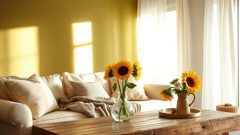
While stark whites can feel chilly, butter yellow paired with tan gives your rooms a sunlit glow that still reads neutral. Paint walls a soft butter yellow in low-traffic areas like dining rooms, then ground it with tan upholstery or a jute rug to keep upkeep easy and costs down.
For a Complementary color pairing effect without bold contrast, layer tones: tan linen curtains, honey-oak frames, and brass hardware. Choose budget-friendly swaps—slipcovers, throw pillows, or peel-and-stick backsplash in creamy yellow—before you commit to paint.
Keep trim and ceilings warm white so the yellow doesn’t look sour. For Color palette inspiration, pull shades from wheat, vanilla, and caramel, then repeat them in lampshades and bedding for a cohesive finish.
Warm Color Schemes With Deep Contrast
Butter yellow and tan keep things light, but you can still stick with warm tones and get more punch by pairing them with deep contrast. Try terracotta walls with espresso trim, or clay pink textiles against near-black metal. You’ll get instant definition without buying new furniture.
Use Color psychology to guide choices: deep browns and oxblood feel grounded and cozy, while warm charcoal adds sophistication without turning cold.
Keep Design harmony by repeating one dark accent at least three times—frame, lamp base, cabinet pull—so it looks intentional.
For budget wins, paint a single door, built-in, or headboard in a rich umber, then swap in rust or saffron pillow covers. Choose matte finishes to hide scuffs and stretch your dollars.
Layer Warm Color Schemes Like a Pro
Because warm palettes can turn flat if you stop at paint, layer them in three budget-friendly bands: a base neutral (cream, camel, warm greige), a mid-tone warm (terracotta, cinnamon, muted coral), and a dark anchor (espresso, bronzed black, deep olive).
Put the base on big-ticket items you won’t replace soon—walls, a sofa slipcover, or an area rug. Add the mid-tone through swap-friendly pieces like pillows, thrifted pottery, or a painted side table.
Use the anchor sparingly in frames, hardware, lamp bases, and one patterned textile to sharpen edges. Color psychology matters: warm mids read welcoming, while dark anchors signal stability.
Lean on historical influences—Tuscan plaster, Arts-and-Crafts wood, Moroccan clay—to guide textures and keep the mix coherent.
Use Warm Color Schemes Room by Room
If you choose warm colors with each room’s job in mind, you’ll get a cohesive look without repainting the whole house. Start with Color psychology: kitchens and dining areas feel lively with buttery cream, terracotta, or muted coral that flatter food and keep energy up.
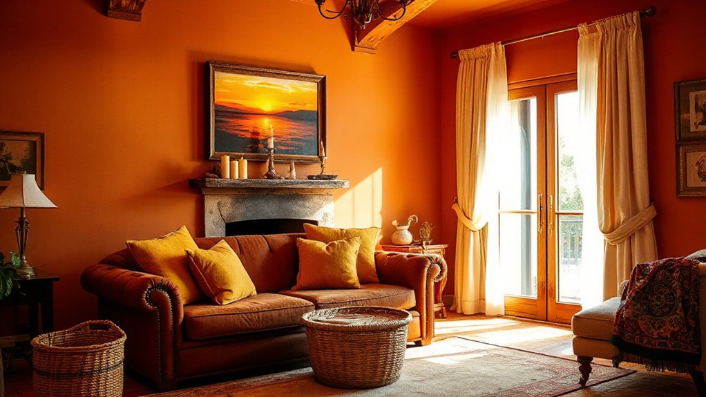
In living rooms, try warm greige, camel, or clay on one wall, then repeat the tone in pillows and a rug to save on paint.
Let Room lighting guide your picks. In north-facing bedrooms, use peachy beige or soft saffron to counter cool daylight; swap bulbs to 2700–3000K for instant warmth.
In south-facing spaces, choose dusty rose or cinnamon that won’t look neon.
For bathrooms, warm white plus brass or wood accents reads clean, not cold.
Avoid These Warm Color Scheme Mistakes
When you switch from gray to warm colors, you can’t plaster every wall with fully saturated reds or oranges without making the room feel smaller and more expensive to fix.
You’ll save money by using saturated hues as accents and keeping the main surfaces in softer, warmer tones.
Also, you’ve got to account for lighting—test swatches in morning and evening light so your “cozy” shade doesn’t turn muddy or harsh under bulbs and shadows.
Overusing Saturated Hues
Although saturated warm hues like chili red, marigold, and tangerine can energize a room fast, using them everywhere makes the space feel smaller, harsher, and harder to live in. Control Color saturation by picking one “hero” surface—an accent wall, cabinet run, or area rug—and keep the rest in softer warm neutrals like clay, oat, or blush.
For Visual harmony, repeat the bold color in two or three small touches (pillows, art, a vase) instead of across every wall. If you’ve already painted too bright, you don’t need a full repaint: tone it down with a matte topcoat, swap in warm white trim, or add large neutral textiles. You’ll still get warmth without visual fatigue over time.
Ignoring Lighting Conditions
Bold warms look their best only if the light supports them, so don’t pick chili red or buttery yellow from a paint chip without checking your room’s exposure and bulbs. North-facing rooms mute warmth under natural light, making terracotta read muddy; south-facing rooms can push the same shade overly orange. Test with a $5 sample or peel-and-stick swatch on two walls, then view it morning, afternoon, and night.
Next, match your artificial lighting: 2700K bulbs enhance cozy tones, while 4000K can turn them harsh or sallow. Keep one bulb type in the space so colors stay consistent. If you can’t swap fixtures, choose a slightly softened warm (clay, wheat, blush) to avoid expensive repaints.
Also check lamp shades and dimmers for shifts.
Frequently Asked Questions
What Warm Colors Work Best in North-Facing Rooms With Cool Daylight?
In north-facing rooms with cool daylight, you’ll get the best warmth from creamy off-whites, soft warm beige, peachy tan, muted terracotta, and buttery yellow.
You’ll boost Natural light enhancement by choosing higher-LRV paints in these warm neutrals and keeping trim a warm white.
Add Complementary accent walls in clay, cinnamon, or deep caramel to counter blue casts without darkening.
Sample large swatches; cheap tester pots save rework.
How Do I Match Warm Wall Colors With Existing Gray Flooring?
You can match warm walls to gray flooring by choosing warm neutrals with the same undertone as your gray—greige, creamy beige, or soft clay—so the floor won’t look bluish. Test the theory that one “wrong” swatch ruins a room; you’ll feel instant relief when samples align.
Use Complementary accent walls in terracotta or muted olive.
Build Warm color palettes for furniture with oak, cognac leather, and brass, on a budget.
Which Warm Color Schemes Increase Resale Value Without Feeling Trendy?
You’ll boost resale value with warm neutrals that read classic: creamy off-white, soft greige-leaning beige, light taupe, and muted clay with crisp white trim.
Warm color psychology says buyers feel comfort and cleanliness without “trend fatigue.” Use Cozy accent walls sparingly—one terracotta, caramel, or deep olive wall in dining or den—then keep adjacent rooms lighter.
Pick low-VOC paint, satin finish, and sample boards to avoid repainting.
Are Warm Colors Suitable for Small Apartments Without Making Rooms Look Smaller?
Yes—warm colors can suit small apartments, and they won’t automatically shrink rooms. If you worry they’ll feel cramped, choose light, muted warms (creamy white, pale terracotta, honey beige) and keep ceilings a touch lighter to lift height.
Color psychology helps: warm tones feel cozy without heaviness when you balance them with daylight and crisp trim.
For furniture coordination, repeat one warm accent in textiles, and keep big pieces neutral to save money.
What Paint Finishes Work Best for Warm Tones in High-Traffic Areas?
You’ll get the best results with satin or semi-gloss for warm tones in high-traffic areas, since these paint sheen options resist scuffs and clean easily.
Use eggshell in living rooms if you want a softer look, but expect more touch-ups.
For durability considerations, choose a washable, high-quality acrylic latex and add a primer where walls take hits.
You’ll spend a bit more upfront, but you’ll repaint less often.
Conclusion
When you ditch gray, you don’t need a full remodel—you need a smart warm baseline and a few intentional layers. Start with cream, sand, or caramel on big surfaces, then add terracotta, blush, or clay through paint, textiles, and thrifted décor. Balance it with deep contrast so the room doesn’t feel flat. Think of warmth like a low-cost dimmer switch: you control the mood. Measure samples, test light, and avoid over-saturating.