
To transform your home with an unexpected color palette, start with one anchor hue that fits your mood, then add a contrasting temperature and a neutral to keep it livable. Try dusty lavender with warm terracotta, inky navy with soft blush, olive with buttery yellow, sage with dusty pink, or black and cream with a single bold accent like cobalt. Repeat each key tone at least three times in textiles, art, and finishes, and test swatches in daylight and lamplight. Up next, you’ll see where each combo works best and how to try it without repainting.
Key Takeaways
- Start with an anchor color that fits your mood, then add a contrasting temperature hue and a grounding neutral.
- Test paint swatches and fabric samples in morning, afternoon, and lamp light to ensure the palette stays consistent.
- Keep cohesion by repeating the neutral and accent colors across at least three elements, like rugs, pillows, and artwork.
- Try unexpected pairings: dusty lavender/terracotta, olive/buttery yellow, teal/burnt orange, inky navy/blush, charcoal/cinnamon.
- Elevate any palette with layered textures and consistent finishes, like linen, velvet, oak, honed stone, matte paint, and brushed brass.
How to Choose an Unexpected Color Palette
If you want an unexpected color palette that still feels intentional, start by choosing one “anchor” color that matches the mood you’re after (warm, cool, muted, or high-saturation), then pair it with a contrasting hue from a different temperature family and a neutral that controls the overall volume.
Next, test that trio under your real lighting: morning, afternoon, and lamps at night. Use Color psychology to guide choices—greens calm, reds energize, blues focus—so the surprise still supports how you live.
Pull inspiration from seasonal color trends, but translate them into materials you already own: a rug, art print, or tile can validate the combo fast.
Finally, sample large swatches and photograph them; your phone reveals undertones your eyes miss.
Color Palette Rules That Keep It Cohesive
To keep an unexpected palette cohesive, you’ve got to repeat key tones across at least two elements—like a muted teal in the rug and a throw—so it reads intentional.
Next, balance warm and cool hues by letting one side lead and the other accent, which keeps the mix modern instead of muddy.
Finally, lock it all in with one neutral anchor (cream, greige, or soft black) that shows up in a major surface and a few small touches.
Repeat Key Tones
Although an unexpected palette thrives on contrast, it stays polished when you repeat a few key tones across the whole look. Pick one anchor color and one supporting neutral, then echo them in at least three places: a rug motif, throw piping, and artwork mats. This repetition creates Color harmony without making the scheme feel matchy.
Use tonal variations of your anchors to add depth while keeping the room cohesive. If your statement color is emerald, layer moss, jade, and deep green-black through ceramics, upholstery texture, and painted trim. Keep the repeats small but intentional: lamp bases, book spines, and vases work better than another big wall.
When you introduce a new accent, tie it back with a stripe, stitch, or print that already includes your anchors.
Balance Warm And Cool
When you mix warm and cool colors on purpose, your unexpected palette reads curated instead of chaotic. Start by choosing a dominant temperature (about 70%) and a supporting opposite (30%) so the room still feels intentional.
If you’re pairing rust with teal or blush with olive, keep one side muted and let the other carry saturation for a modern, designer look.
Use Complementary color schemes with control: repeat the warm note in small hits (pillows, art, a vase) and echo the cool note in larger planes (rug, drapery, sofa) to steady the contrast.
Then soften transitions with Monochromatic variations inside each temperature—think multiple terracottas or layered blue-grays—so your eye moves smoothly instead of bouncing.
Keep finishes consistent across metals and woods.
Use One Neutral Anchor
Mixing warm and cool tones feels intentional faster if you give the whole palette one neutral anchor. Pick a steady base—creamy off-white, greige, putty, charcoal, or soft black—then repeat it in at least three spots: walls, a large rug, and one major upholstery piece.
Treat that anchor like your palette’s “pause button” so your bolder colors can play without clashing. If you’re using unexpected pairings (rust with periwinkle, olive with blush), keep the neutral’s undertone consistent: warm neutrals for terracotta and brass, cooler neutrals for cobalt and chrome.
For tight color harmony, match finishes too—matte paint, textured linen, or honed stone—so the anchor reads cohesive, not flat.
Dusty Lavender and Warm Terracotta Palette
Pair dusty lavender with warm terracotta to balance cool and warm tones without making the room feel split—use lavender on larger, softer surfaces and terracotta as grounding accents.
Keep the mix current by matching undertones (gray-leaning lavender, clay-leaning terracotta) and repeating each color at least twice across the space.
You’ll get the best result when you layer natural textures like linen, oak, rattan, and matte ceramics to bridge the temperature shift and add depth.
Balancing Cool And Warm
Although dusty lavender reads as cool and quiet, it won’t feel icy once you anchor it with warm terracotta in the right proportions. Use the 60/30/10 rule: lavender on 60% (walls or a large rug), terracotta on 30% (sofa, curtains, or cabinetry), then add 10% in crisp off-white or matte black to sharpen contrast.
Lean on Color psychology for Mood enhancement: lavender calms and steadies, while terracotta adds sociable warmth. Keep lavender slightly gray to stay modern, and choose terracotta with a clay undertone, not orange, to avoid a retro look.
Repeat each hue at least three times around the room, and match their saturation so neither dominates. Use warm LEDs to unify everything.
Styling With Natural Textures
When you layer dusty lavender and warm terracotta with natural textures, the palette stops feeling “styled” and starts feeling lived-in.
Start with a Natural fiber rug—jute, sisal, or flatweave wool—to ground the softness and add grit. Bring terracotta in through clay planters, a matte lamp base, or linen cushions; use lavender on walls or a throw for a muted lift.
Mix in wood tones with visible grain, then add cane or rattan for airy warmth. Keep metals brushed, not shiny, so the colors stay earthy.
Choose textiles with Organic patterns—block prints, subtle stripes, or tonal florals—so the room feels current without shouting.
Finish with one textured ceramic bowl or a woven tray to pull it together.
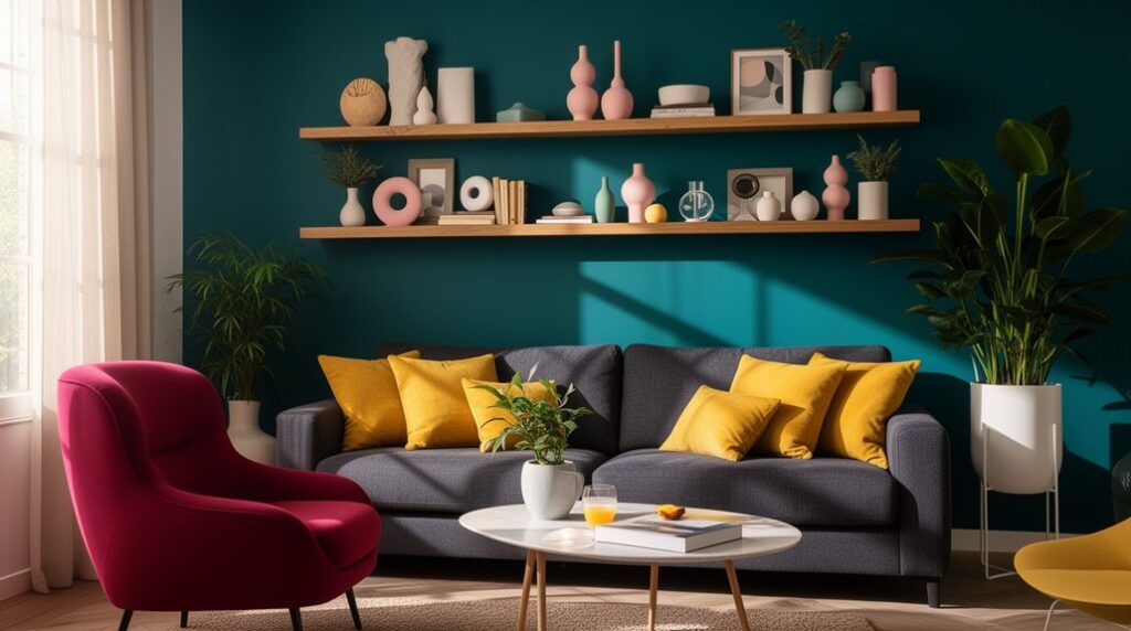
Inky Navy and Soft Blush Color Palette
If you want a palette that feels modern but still grounded, inky navy and soft blush deliver high contrast without the harshness of black-and-pink. Color psychology says navy reads stable and sophisticated, while blush softens the mood and adds approachability, which fits current interior design trends toward calming, elevated spaces.
Use navy on built-ins, a sofa, or a feature wall, then layer blush through textiles: velvet pillows, a wool throw, or drapery lining. Keep undertones consistent—choose a cool blush with blue-based navy, or a peachy blush with warmer navy.
Balance with light oak, brass, and creamy off-white to prevent the room from feeling heavy. Add one patterned element—stripe or abstract—so the contrast looks intentional.
Olive Green and Buttery Yellow Palette
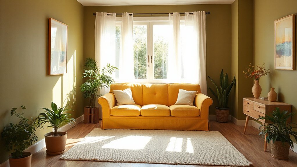
Because olive sits close to nature’s neutrals, pairing it with buttery yellow gives you a fresh, optimistic palette that still feels grounded and grown-up. Use olive on larger surfaces—kitchen cabinets, a sofa, or built-ins—then layer buttery yellow through curtains, accent chairs, or a lacquered side table for controlled brightness.
Lean into Palette psychology: olive signals stability, while yellow boosts energy, making this combo ideal for entryways, breakfast nooks, or home offices. Keep undertones aligned by choosing olive with a warm, slightly dusty cast and yellow with creamy, not neon, depth.
Balance with tactile neutrals like oatmeal linen, rattan, and matte brass. In Color therapy terms, you’ll get calm focus plus a gentle lift without feeling overly trendy.
Charcoal Gray and Cinnamon Brown Palette
Although charcoal gray reads sleek and modern, cinnamon brown warms it up instantly, giving you a palette that feels current but not cold. Use charcoal on larger surfaces—built-ins, an accent wall, or lower cabinets—then layer cinnamon through leather, walnut, or clay-toned textiles to keep the room grounded.
Color psychology matters here: gray signals focus and sophistication, while brown adds security and comfort, so you’ll get a calm, upscale vibe that still feels livable.
Choose paint finish options strategically: go eggshell or satin on walls for wipeability, matte on ceilings to hide flaws, and semi-gloss on trim for crisp contrast.
Balance undertones by pairing both with warm whites and brass, and test swatches in daytime and lamplight.
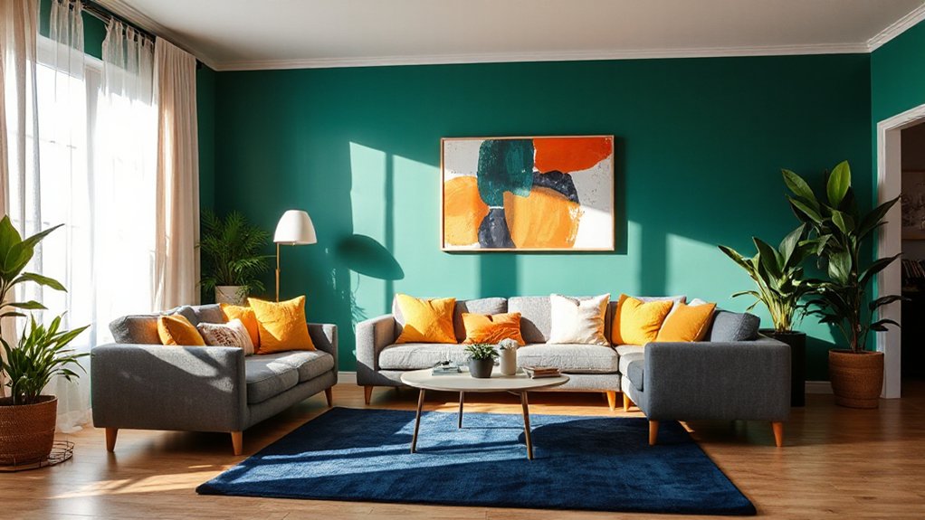
Teal and Burnt Orange Color Palette
Few color pairings hit as hard as teal and burnt orange: teal brings depth and a cool, tailored feel, while burnt orange adds instant warmth and a modern, vintage-leaning edge.
Use it like a smart take on Complementary color schemes: keep teal dominant on walls or cabinetry, then add burnt orange through pillows, art, or a statement chair. Balance the contrast with creamy whites, camel leather, and matte black hardware so it reads curated, not loud.
For Monochromatic palette variations, layer multiple teals (ink, jade, sea-glass) in rugs and drapery, then repeat burnt orange in smaller, consistent hits.
Choose brushed brass lighting to bridge both tones, and stick to textured fabrics—bouclé, velvet, wool—to make the palette feel rich.
Sage Green and Dusty Pink Color Palette
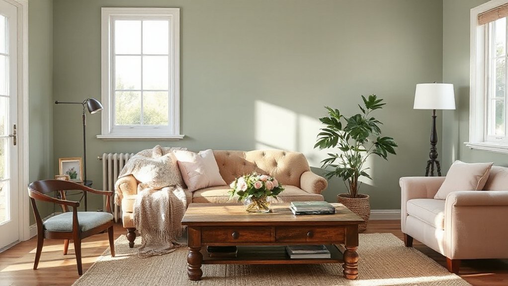
One of the easiest ways to get a calm, current space without slipping into bland is pairing sage green with dusty pink: sage reads grounded and organic, while dusty pink softens it with a muted, modern warmth.
Use sage on larger surfaces—walls, cabinetry, or a sofa—then layer dusty pink through textiles like curtains, bedding, and a low-pile rug.
For smarter color mixing, keep undertones aligned: choose gray-leaning sage with rosy-beige pink, or olive sage with clay pink, and repeat each color at least three times.
Add contrast with brushed brass, light oak, or matte black hardware without overpowering the palette.
For mood enhancement, prioritize warm, diffused lighting and natural textures (linen, boucle, rattan) so the colors stay serene, not sweet.
Black and Cream With One Bold Accent
You can anchor a room with black and cream, then punch it up with one bold accent—cobalt, chartreuse, or paprika—used in a single hero piece like a chair, artwork, or rug.
Keep the contrast crisp but warm by choosing creamy, slightly off-white tones and repeating the accent in small hits (pillows, a vase, lamp shade) to control the intensity.
Finish the look with layered textures—matte black metal, nubby linen, boucle, and warm wood—to add depth without adding more colors.
Striking Accent Color Choices
Why does black and cream feel so modern right now? You get sharp contrast without the coldness of all-white, and it sets up a perfect stage for one punchy accent.
Pick a single saturated hue—cobalt, oxblood, chartreuse, or terracotta—and repeat it exactly three times so it reads intentional.
Use Bold wallpaper on one focal wall, keeping the pattern high-contrast but limited to your chosen accent and neutrals. Then add statement furnishings in that same accent: a lacquered side table, velvet chair, or oversized art with a dominant color block.
Anchor everything else in matte black hardware, cream textiles, and simple wood tones. Finish with small repeats—pillows, a tray, or a lamp base—to lock the palette in place.
Keep accents limited for impact.
Balancing Contrast And Warmth
Although black and cream deliver instant graphic contrast, the look only feels livable when you deliberately build warmth into the mix—then let a single bold accent do the talking.
Start with creamy walls and matte-black trim or lighting to keep the palette crisp without feeling cold. Choose one saturated note—cobalt, oxblood, or chartreuse—and commit to it in a single high-impact move, like an Accent wall behind the sofa or bed.
Keep the rest disciplined: repeat the accent just twice more in small, controlled doses (a lamp base, art, or a vase) so it reads intentional, not busy.
For furniture pairing, anchor with black-framed pieces and creamy upholstery, then add warm wood or brass to soften the edges.
Styling With Texture Layers
Once you’ve set black and cream’s sharp contrast and chosen your one bold accent, texture becomes the tool that keeps the scheme from feeling flat. Start with a cream bouclé sofa or nubby linen curtains, then anchor the room with black metal, lacquer, or stained oak for crisp edges.
Add textural layering in three heights: a low-pile rug, a ribbed ottoman, and a woven shade or slatted screen to build visual depth without adding more colors. Keep your accent—cobalt, chartreuse, or terracotta—in one standout material, like glossy ceramic or velvet, so it reads intentional.
Mix matte and sheen on the same surface: a honed stone top with glossy black accessories. Finish with tactile lighting—paper lanterns or pleated shades—to soften contrast.
Where Each Color Palette Works Best
If you match an unexpected palette to the right setting, it’ll read intentional rather than “off.” High-contrast pairings (like cobalt + rust or black + butter yellow) work best in modern spaces, bold branding, and social-first visuals where you need instant impact.
While muted, dusty mixes (sage + mauve or clay + powder blue) shine in wellness, hospitality, and lifestyle interiors that prioritize calm.
Use jewel tones with warm neutrals in dining rooms and entries to signal energy and confidence through Color psychology. Try deep teal + camel for offices where you want focus without sterility.
Put citrus accents against soft grays in kitchens and gyms for Mood enhancement and a clean, active feel. Reserve blush + olive for bedrooms and reading nooks where you’re chasing restorative quiet.
In open-plan homes, keep transitions seamless by repeating one anchor hue across adjacent zones.
Try a New Color Palette Without Repainting
Before you commit to paint, test-drive a new palette by swapping the surfaces and accessories that carry the most visual weight: textiles, lighting, art, and a few “anchor” pieces. Start with a rug or duvet that hits your target mix (say, plum + camel + cream), then echo it in throw pillows, curtains, and one standout lamp shade.
Use Color psychology: warmer tones energize social zones, while cooler hues calm bedrooms and offices.
Next, handle furniture coordination by choosing one “bridge” color that links existing wood, metal, and upholstery—like olive to soften brass and walnut.
Finally, edit small décor: books, vases, and frames in two finishes keep it current. Photograph the room in daylight and at night before buying more.
Frequently Asked Questions
What Paint Sheen Works Best for Bold, Unexpected Color Combinations?
For bold, unexpected color combinations, you’ll get the best results with an eggshell or satin sheen. They reflect enough light to make saturated hues pop without exaggerating wall flaws, and they blend well where colors meet.
If you’re painting trim or doors, choose semi-gloss for extra finish durability and crisp contrast.
Use color psychology to guide sheen: higher sheen feels energetic; lower sheen reads calmer overall.
How Do I Coordinate Unexpected Palettes With Existing Wood Tones?
You coordinate unexpected palettes with existing wood tones by treating the wood as your anchor—it’s so powerful it can tame a rainbow.
Start with Color matching: identify whether your wood reads warm (honey, red) or cool (ashy, gray) and pick one palette color that echoes that undertone.
Then add a contrasting pop for edge.
Repeat those hues in Furniture accents—pillows, art, hardware—to unify the room.
Will Unconventional Color Palettes Affect My Home’s Resale Value?
Yes, unconventional palettes can affect resale, but you control the impact. If you boost aesthetic appeal without alienating buyers, you can protect market value.
Keep bold color to easily repainted rooms, and use neutrals on permanent surfaces like cabinets and tile. Choose on-trend, muted versions of unusual hues, and repeat them in small accents for cohesion.
Before listing, you can stage with softer accessories or repaint feature walls.
What Lighting Temperature Best Showcases These Unexpected Color Pairings?
Choose neutral-warm 3000K lighting, and you’ll hit the nail on the head for most unexpected pairings.
Use high-CRI (90+) artificial lighting so undertones stay true and don’t muddy.
Test 2700K if your palette leans earthy, or 3500K if it’s cooler and graphic.
Always check samples in natural sunlight, morning and late afternoon, because shifting daylight reveals hidden casts and contrast changes quickly.
How Can I Test These Palettes on a Budget Before Committing?
You can test palettes cheaply by doing Color sampling with peel-and-stick swatches or sample pots, then painting large poster boards. Move them around rooms and view them morning, afternoon, and night.
For Budget testing, start with textiles: thrifted pillows, throws, or curtain panels in your key hues. Use removable wallpaper or washi tape for accents.
Photograph combos, then edit in a free app to compare undertones.
Conclusion
You don’t need a safe beige to make your home feel pulled together—you need a palette with a little spark. Treat color like a well-styled outfit: keep one shade in the lead, let the others play support, and repeat them in textiles, art, and decor. Test your combo with swatches, pillows, and peel-and-stick accents before you commit. When you mix the unexpected, your rooms don’t just change—they sing.