Choose hues like you’d choose a daily soundtrack: start with mood words (calm, lively, grounded) to narrow a hue family, then pick two values—a lighter wall color and a deeper trim or accent. Match undertones to your floors and existing rugs or art so you don’t repaint later. In high-traffic rooms, go mid-tone with eggshell on walls and semi-gloss on trim. Use peel-and-stick samples, and watch them morning and night to confirm. Keep going for room-by-room shortcuts.
Key Takeaways
- Start with 2–3 mood words to narrow a hue family, choosing cooler tones for calm and warmer tones for energy.
- Match undertones across walls, trim, flooring, and key furnishings to prevent clashing and keep the palette harmonious.
- Build a simple palette using the 60-30-10 rule: dominant hue, supporting color, and a small accent repeated at least twice.
- Test peel-and-stick samples on the most visible wall and observe them morning and night before committing.
- Choose mid-tone, wipeable finishes for high-traffic rooms, reserving lighter, fussier hues for low-traffic areas.
Choose Hues by the Mood You Want
If you start with the mood you want a room to deliver, choosing paint colors gets faster and cheaper because you’ll buy fewer “maybe” samples. Write three mood words (calm, lively, grounded) and match them to a tight hue family: blue-green, warm white, terracotta.
Then test only two values: one lighter for walls, one deeper for trim or an accent.
Check Color history and cultural influences before you commit. A “neutral” today might read formal, festive, or somber depending on your background and visitors.
Pull cues from items you already own—rug, art, wood tone—so you’re not repainting to fit new purchases.
Use peel-and-stick samples, label them, and view them morning and night.
Use Color Psychology Without Overthinking It
Although color psychology gets marketed like a rulebook, you can treat it as a quick filter, not a promise of how you’ll feel every day. Start with broad tendencies: cooler hues often read calmer, warmer hues often read energizing, and muted tones usually feel easier to live with than high-saturation brights.
Then reality-check with your own history—if you hate yellow, no “optimism” label will change that.
Use color symbolism as a shortcut, not a mandate, and watch for cultural associations that shift meanings (white can signal purity or mourning, red can mean luck or warning). Before committing, buy small paint pots or sample cards and view them morning and night. You’ll avoid costly repaints and impulse buys.
Match Hues to Room Function and Traffic
Start by matching hues to what you actually do in the room—calming, low-contrast pairings for rest, and higher-contrast combos where you need focus and visibility.
In busy zones like halls, kitchens, and kids’ spaces, you’ll save money by choosing mid-tone colors and finishes that hide scuffs and clean easily.
Then you can reserve lighter, fussier shades for low-traffic areas where they won’t show every mark.
Function-First Color Pairing
Because every room works differently, you’ll get better results (and fewer repainting regrets) when you pair colors to function and foot traffic first, not trend boards. Start by listing what you do there: focus work, unwind, cook, host, or sleep.
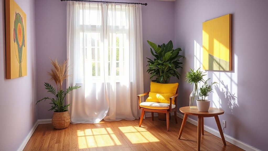
For offices and kitchens, choose higher-contrast pairings that keep you alert; try complementary color schemes in small doses—like a muted blue wall with warm terracotta accents—so you don’t need pricey overhauls later.
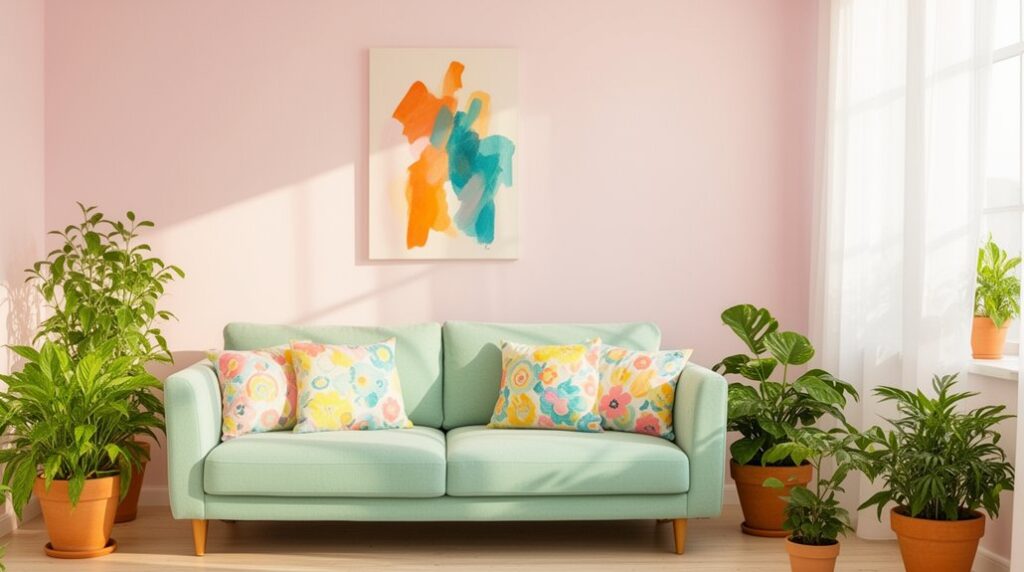
For bedrooms and reading nooks, aim for Monochromatic harmony: one hue in three values (light wall, mid-tone textiles, dark trim) builds calm without extra patterns.
In open plans, repeat one anchor color across zones, then shift saturation by area to signal purpose.
High-Traffic Durability Choices
Once you’ve matched colors to how a room feels and functions, make sure those hues can survive real life where people actually walk, touch, and bump into things. In hallways, kitchens, kids’ rooms, and entryways, pick mid-tone or slightly muted shades that won’t spotlight every scuff or fingerprint.
Choose durability finishes: satin or semi-gloss on trim and doors for wipeability, and eggshell or satin on walls for a balance of sheen and touch-ups. Use stain resistant paints in splash zones behind trash cans, near light switches, and around dining chairs.
If you’re budget-minded, spend more on the highest-traffic walls and use standard paint in low-contact areas. Add washable mats and felt pads to reduce wear and repaint cycles.
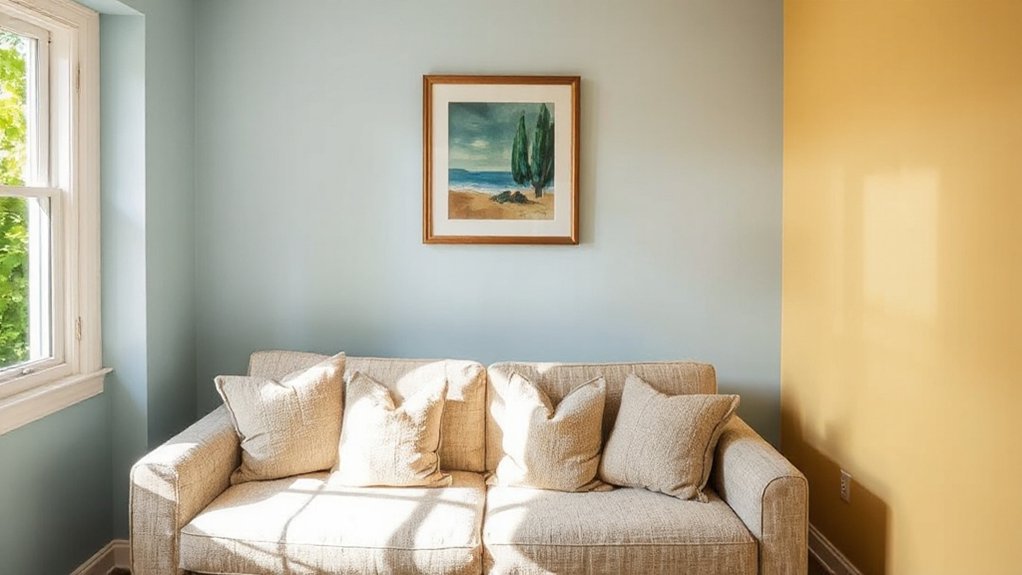
Pick Warm vs Cool Hues for Comfort
While you’re choosing a palette, decide whether you want the room to feel cozier or calmer, then lean warm or cool to get there without spending more than you need to.
Warm hues (creamy whites, sand, terracotta) visually pull in walls and soften edges, so bedrooms and living rooms feel snug.
Cool hues (blue-grays, sage, soft navy) recede, making small spaces feel airier and more orderly.
Pay attention to Color temperature differences: warm undertones fight a sterile vibe, while cool undertones reduce visual “heat” in busy rooms.
Track Emotional responses to hues, too—reds and oranges energize, blues and greens settle.
To save money, use one main wall color and shift comfort with inexpensive textiles, art, and accessories in the same temperature range.
Test Hues in Your Room’s Real Light
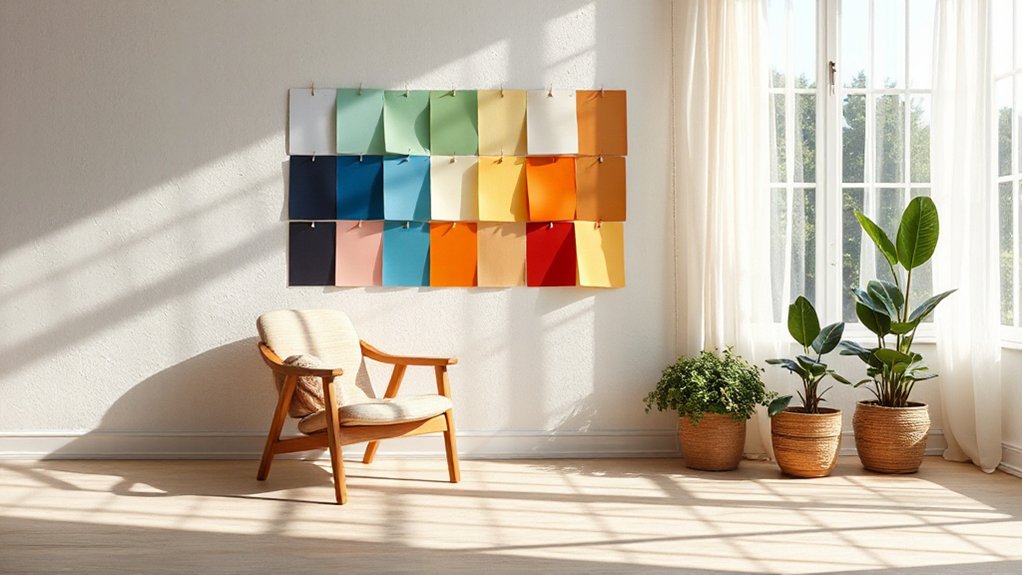
Even if a paint chip looks perfect under store fluorescents, your room’s daylight, lamp bulbs, and shadows can shift it warmer, cooler, darker, or more saturated, so test before you buy gallons.
Grab sample pots or peel-and-stick swatches and place them on multiple walls near windows, corners, and trim. Check them morning, afternoon, and at night with every bulb you use; note lighting effects like glare, bounce light, and dimmer settings.
Paint two coats on poster board so you can move it and avoid patching. Compare against flooring and upholstery, not just white drywall.
If you’re blending spaces, use color blending techniques: test adjacent swatches together and watch how edges read across doorways and hallways.
Scale Hues for Small vs Large Rooms
Because a room’s size changes how much color you see at once, you should scale saturation and contrast to the space. In small rooms, strong color can feel louder, so pick lighter tints or slightly muted versions on large surfaces. Save deeper shades for a single door, niche, or built-in to add depth without crowding.
In large rooms, pale paint can look washed out, so raise saturation a step or two, or choose a midtone to keep the space feeling intentional. Use room proportions as your guide: tall walls handle deeper value better than low-ceiling rooms.
If you’re on a budget, paint only the most visible wall first, then adjust. Sample in big swatches; tiny chips mislead at scale.
Pair Hues With a Simple Color Scheme
Pick one dominant hue for the room and commit to it on the largest surfaces, so you don’t waste money repainting or buying extra décor.
Then add two or three coordinating accent colors in smaller doses—pillows, art, rugs, or a single chair—to control cost and keep the look cohesive.
Stick to the same undertone (warm or cool) across your accents so everything matches without needing custom pieces.
Choose A Dominant Hue
Once you know the mood you’re aiming for, choose one dominant hue to do the heavy lifting, then keep the rest of the palette simple. Pick where it’ll live most: a main wall, large rug, or sofa. That way you’ll spend on one impactful item and keep supporting pieces neutral and easier to replace.
Test swatches in morning and evening light, and watch how hue saturation shifts; a high-saturation paint can feel loud at night, while a softer version stays calm.
For smooth color blending, repeat the dominant hue in two or three nearby values (lighter or darker) rather than introducing multiple competing colors. Use the 60-30-10 rule as a guide, but commit the 60% to your dominant hue.
Add Coordinating Accent Colors
With your dominant hue set, build the rest of the room around it using a simple accent scheme so the color feels intentional, not busy. Pick one supporting neutral (warm white, greige, or charcoal) to anchor big-ticket items like rugs, sofas, and curtains, and you’ll avoid costly replacements later.
Then choose one accent color for smaller, swappable pieces—pillows, throws, art, and a single statement vase.
For energy, try Complementary color schemes: pair a blue room with small hits of orange, or green with pink, keeping the accent to about 10–15% of what you see.
For calm, use Monochromatic palette choices by stepping lighter and darker within your main hue, mixing paint, textiles, and wood tones for depth without clutter.
Balance Bold Hues With Neutrals and Texture
Although bold colors can energize a room, they’ll look sharper and more livable when you anchor them with neutrals and layer in texture. Start with a dependable base—warm white, greige, tan, or soft charcoal—on large surfaces like walls, rugs, and sofas so your statement hue reads intentional, not chaotic.
Then add the bold color in controlled doses: a painted door, curtains, or two pillows, repeating it at least twice for cohesion. If you’re using Complementary color schemes, let one hue dominate and keep its opposite as a small accent.
Texture does the heavy lifting on a budget: linen drapes, boucle throws, jute rugs, and matte ceramics. For depth without new furniture, try Textured wall finishes like peel-and-stick grasscloth, limewash, or a subtle sand paint.
Avoid Common Hue Mistakes That Overwhelm
If you don’t plan your hues in advance, even “pretty” colors can pile up and make a room feel busy or smaller than it is. Limit your palette to one main hue, one supporting hue, and a neutral, then repeat them across textiles and decor for hue consistency.
Watch color saturation: too many fully saturated paints, pillows, and art pieces compete and create visual noise. Instead, choose one high-saturation accent and keep the rest mid-tone or muted; it’s cheaper than repainting everything. Test swatches in morning and evening light, and don’t rely on tiny paint chips.
Keep undertones aligned (warm with warm, cool with cool) so trim, flooring, and walls don’t clash. Finally, leave some “rest” space—solid neutrals and open surfaces—to keep the mood calm.
Frequently Asked Questions
What Paint Finish Best Supports Mood-Enhancing Colors: Matte, Eggshell, or Satin?
You’ll usually get the best mood-friendly result with eggshell: it keeps Mood boosting color palettes soft, reflects a little light, and hides wall flaws without feeling flat.
Choose matte if you want maximum calm and minimal glare, but expect more scuffs and touch-ups.
Pick satin for kitchens, baths, or kids’ rooms where you need wipeable durability, though it can highlight imperfections.
Compare Paint sheen options by room traffic and your budget.
How Can I Coordinate Hues With Existing Furniture Without Repainting Everything?
Start with your furniture’s dominant tone—then match, don’t repaint. Here’s the trick: pull two colors from upholstery or wood undertones, and repeat them in pillows, rugs, and art.
Use complementary color schemes for controlled contrast (navy sofa, rust accents). Test with removable swatches and thrifted textiles.
For bigger impact, try accent wall ideas like peel-and-stick wallpaper or a painted panel behind shelves. Keep purchases small, layered, and returnable.
Which Hues Photograph Best for Video Calls and Social Media Content?
You’ll photograph best in soft, mid-tone neutrals: warm greige, light taupe, muted sage, dusty blue, or creamy off-white. They flatter most skin tones, reduce camera noise, and avoid harsh color casts—Color psychology also reads them as calm and trustworthy.
Keep hue harmony by matching your backdrop to your outfit’s undertone. Skip bright reds and neon greens. Use inexpensive peel-and-stick panels or a thrifted curtain.
How Do I Choose Hues That Accommodate Color Blindness or Visual Sensitivities?
Start by prioritizing contrast and texture, not just hue, so everyone reads your space comfortably.
About 1 in 12 men and 1 in 200 women have color-vision deficiency, so test choices in grayscale.
Build accessible color palettes with light–dark separation, clear labels, and matte finishes to cut glare.
Choose sensory-friendly shades like muted blues, warm off-whites, and soft greens.
Buy sample cards first, then paint testers.
What Are Budget-Friendly Ways to Add New Hues Without Buying Paint?
Skip paint and shift hues with affordable decor you can swap fast: thrifted pillows, throws, and curtains in one accent color. Add peel-and-stick wallpaper or removable decals to a small wall or cabinet front.
Use natural color accents—branches, dried flowers, fruit bowls, herbs, or stones—to bring in new tones free or cheap.
Rearrange art, frame fabric scraps, or cover lampshades with colored paper to refresh lighting.
Conclusion
You don’t need a designer budget to choose hues that lift your mood—you need a plan and a quick reality check. Color psychology suggests blues calm and reds energize, but studies show context and personal memory can override “universal” effects, so trust your reactions. Test large paint swatches for a few days in real light, then commit. Keep one bold hue, anchor it with low-cost neutrals and textured textiles, and you’ll avoid overwhelm.