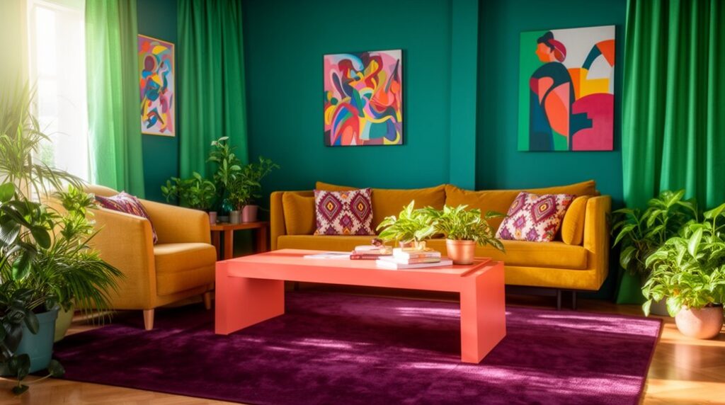
Skip beige by choosing an anchor color you’ll keep long-term, then add one neutral and one accent with easy swaps like pillow covers, throws, art, and warmer 2700K lighting. Try emerald and camel with brass for instant luxe, navy and terracotta for grounded coziness, plum and olive for moody depth, teal and rust for a bold-but-livable punch, charcoal and blush for soft-edged modern drama, or cobalt and citrus for high-contrast energy. Keep going for room-by-room tips.
Key Takeaways
- Choose an anchor color from long-term furniture, then add one neutral and one accent to create a cohesive palette.
- Try emerald and camel for instant luxury, layering velvet-like textiles, wool, and warm brass accents for a high-end look.
- Use plum and olive to build a moody room; add warm 2700K lighting, dimmers, and greenery to prevent the space feeling flat.
- Ground the room with navy and terracotta, using navy as a scuff-hiding “neutral” and terracotta accents to warm up walls and textiles.
- Go bold with cobalt and citrus in swap-friendly pieces like pillows, art, and lamp shades, while keeping large furniture neutral for balance.
Pick Your Living Room Color Palette Anchor
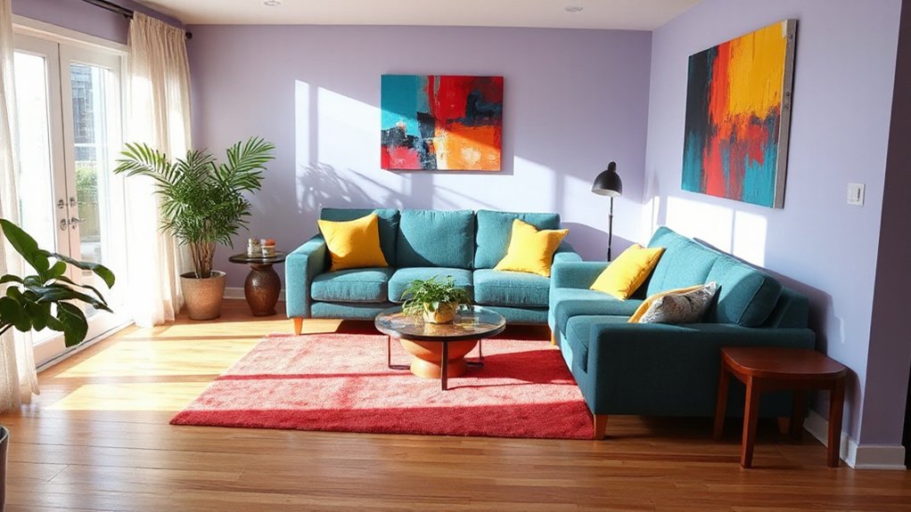
If you want a living room palette that looks intentional (not like a series of impulse buys), start by choosing one anchor color you can’t easily swap out. Think sofa fabric, a big rug, or built-ins—items you’ll keep for years. Use Color psychology: deep blues calm, warm terracottas energize, soft greens balance. Pick the mood you want first, then let the anchor do the heavy lifting.
Next, build furniture coordination around that anchor with two supporting tones: one neutral and one accent. Shop your existing pieces before buying anything new; you might only need pillow covers, art prints, or a throw to tie it together.
Stay trend-aware by choosing accents in current shades, not costly staples. Test with paint swatches at night.
Emerald and Camel for a Luxe Living Room Palette
You can get a luxe look on a budget by pairing emerald accents—like pillows, art, or a throw—with camel upholstery or a rug that grounds the room.
Choose materials that feel expensive without the price tag, such as velvet-look fabrics, faux leather, and textured weaves.
Finish the palette with warm metals like brass or antique gold in lighting and hardware to keep it current and cohesive.
Emerald Accents, Camel Grounding
While bold color can feel risky in a living room, emerald accents paired with camel grounding delivers a luxe look without blowing your budget. Use camel as your base on larger pieces you’re not swapping soon—sofa slipcover, rug, or curtains—then add emerald through easy updates like pillows, a throw, or framed prints.
Lean on color psychology: emerald reads calm and prosperous, while camel feels warm and stable, so the room looks elevated yet welcoming. Pay attention to interior lighting before you buy; emerald skews jewel-toned in daylight but can turn muddy under warm bulbs. If your lighting runs warm, choose slightly brighter emeralds and balance with crisp white trim.
Keep metals minimal and let color do the work.
Materials That Feel Luxe
Emerald and camel already set a high-end mood, and the materials you pair with them decide whether the room reads “designer” or just “nice.” Keep camel in touchable textures—washed linen curtains, a wool or wool-blend rug, or a camel faux-suede slipcover—so the base feels expensive without the price tag.
Layer emerald through textile textures that catch light: velvet pillow covers, a mohair throw, or a performance-chenille ottoman you can actually live with. Add contrast with matte ceramics, ribbed glass vases, and a stone-look tray to avoid a flat, matchy feel.
For lighting styles, skip harsh overheads and use a paper lantern pendant plus a dimmable fabric-shade floor lamp; both soften emerald’s depth and warm camel’s glow. Shop secondhand for solid-wood side tables and re-stain them.
Styling With Warm Metals
Because emerald and camel already bring depth and warmth, the right metals should add glow—not glare. Start with brushed brass or antique gold: they read luxe against green and soften camel’s tan. Keep shiny chrome minimal; if you’ve got it, balance it with warmer pieces so it doesn’t skew cold.
Limit your mix to two metal finishes, then repeat them three times—coffee table legs, frame edges, and cabinet pulls—to make the palette feel intentional.
For budget wins, swap lamp hardware, add thrifted brass trays, or use peel-and-stick metallic film on plain frames. Choose lighting accents with warm bulbs (2700K) and linen shades so the metal reflects softly.
If you want a trend-forward edge, add a small bronze sculptural object.
Navy and Terracotta for Cozy, Grounded Contrast
You can lean on navy as your anchor shade because it reads timeless, hides everyday wear, and makes a small living room feel more pulled together.
Add terracotta through budget-friendly pillows, a throw, or art to warm the space fast and hit that earthy trend without repainting.
Balance the contrast with texture—mix matte navy textiles, woven terracotta accents, and a few natural woods so it feels cozy, not harsh.
Why Navy Works
Why does navy feel so right in a living room? Color psychology says it signals calm, confidence, and depth, so your space feels settled instead of sleepy. It also boosts interior harmony by acting like a neutral with more character than gray, letting other tones read richer without fighting for attention.
You don’t need a full repaint to get the effect. Try navy on one focal wall, built-ins, or even a budget-friendly rug, then repeat it in small hits—pillows, frames, a throw—to look intentional.
Navy hides scuffs better than white and looks high-end under warm bulbs, which saves you from pricey do-overs. It’s also trend-aware: designers keep using it as the new classic anchor.
Terracotta Warming Touches
While navy sets a cool, polished base, terracotta brings in the warm, earthy hit that makes a living room feel instantly cozier and more grounded. Start small with terracotta accents you can swap seasonally: a pair of pillow covers, a thrifted ceramic lamp, or a rust-toned throw.
If you’re renting, try removable wallpaper in a clay shade behind a media console for high impact without paint.
To keep it budget-smart, anchor navy in what you already own—sofa, rug, curtains—then layer terracotta through affordable decor and secondhand finds. Choose matte finishes for a modern, warming interior vibe that’s trending but not loud.
Add one terracotta planter or vase on a shelf to tie the look together fast.
Balancing Contrast And Texture
Navy and terracotta already set the mood; now make the combo feel intentional by balancing contrast and texture, not just color. Use navy as your anchor on big pieces—sofa, rug, or curtains—then repeat terracotta in smaller hits like cushions, art, and a throw to keep costs down.
To sharpen the look, lean on Complementary color schemes: add warm off-white or sand as a buffer, plus a touch of brass or black for definition.
For Layered texture integration, mix matte terracotta pottery with nubby linen, woven rattan, and a low-pile rug; it reads cozy, not heavy.
Keep patterns simple—thin stripes or micro-checks—and scale them differently so the room feels current, not busy.
Finish with one plant and a candle to soften edges.
Plum and Olive for a Moody Living Room Palette
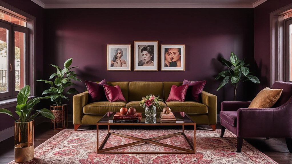
Two rich shades—plum and olive—can instantly dial up a moody, modern living room without forcing a full renovation. Start with color psychology: plum reads luxe and intimate, while olive feels grounded and calm, so the pairing looks intentional, not heavy.
Keep costs down by painting one accent wall in deep plum, then echo olive through a thrifted velvet pillow set, a throw, or an inexpensive rug.
Use lighting techniques to prevent the palette from going flat. Swap to warm LED bulbs (2700K), add a plug-in dimmer, and aim a floor lamp at the plum wall to create soft bounce light.
Finish with brass or black accents for a current, editorial edge. Add greenery for lift.
Teal and Rust for a Bold, Livable Statement
If you want a color combo that feels bold but still easy to live with, teal and rust deliver high contrast without looking chaotic. Use teal as your anchor on a sofa, rug, or painted built-ins, then layer rust through pillows, a throw, and one large art print to keep costs down.
Color psychology backs it up: teal reads calm and balanced, while rust adds warmth and sociability, so the room feels inviting instead of loud. Pull natural inspiration from ocean water and desert clay, and you’ll get a palette that looks intentional year-round.
Keep metals simple—black or aged brass—and choose wood tones that lean medium to warm. For a cheap refresh, swap lamp shades, add a rust ceramic vase, and hang teal curtains.
Charcoal and Blush for Modern, Soft-Edged Drama
While charcoal brings a crisp, modern backbone to the room, blush softens the edges so the space feels designed—not cold. Use charcoal on one anchor: a sofa, media console, or painted accent wall, then layer blush through pillows, a throw, and art for low-cost impact.
Color psychology matters: charcoal signals calm and confidence, while blush adds approachability, making conversation areas feel welcoming.
Keep your furniture arrangement tight and intentional—float seating on a rug, face chairs toward the sofa, and leave clear walkways so the palette reads curated, not heavy. Balance contrast with warm metals and pale oak to avoid a gloomy cast.
If you’re renting, swap in blush curtains and a charcoal slipcover. Finish with matte black frames for a current look.
Cobalt and Citrus for a Bright, High-Contrast Palette
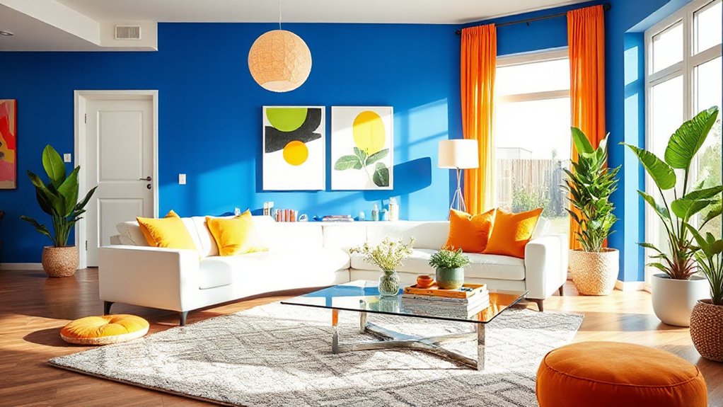
Because cobalt reads crisp and saturated, it gives your living room instant energy, and a hit of citrus keeps it feeling playful instead of formal. Use Color psychology: blue signals confidence and calm, while lemon or tangerine adds optimism.
You don’t need to repaint—start with cobalt pillow covers, a thrifted ceramic lamp base, or a budget rug with blue grounding the pattern. Add citrus in small, swap-friendly pieces like a throw, art prints, or spray-painted vases.
For furniture coordination, keep big items neutral: a gray sofa, white media console, or light-wood coffee table won’t fight the contrast. If you’ve got dark leather, choose cobalt textiles to bridge it, then repeat citrus twice for balance.
Finish with brass accents for a current, high-impact look.
Frequently Asked Questions
How Do I Choose Paint Finishes for High-Traffic Living Rooms?
Choose durable, washable finishes where hands and furniture rub most. Use matte vs. satin wisely: pick satin or eggshell for main walls because they clean easily. Then use matte on low-touch areas to hide imperfections.
Add semi-gloss on trim for scuff protection. Look for stain resistant finishes and “scrubbable” labels; they cost more upfront but save repainting money.
Test samples under lighting, then buy during sales.
Which Lighting Temperatures Make Bold Wall Colors Look More Natural?
You’ll get the most natural look from neutral-white LEDs around 3500K–4000K, since they balance warmth and clarity for bold walls.
Choose, compare, commit: test 2700K for cozy reds, 3000K for richer tones, and 4000K for crisp blues/greens.
Prioritize high CRI (90+) for color accuracy and better Lighting effects.
Buy a few affordable bulbs first, then match fixtures for a current, layered-light trend.
How Can Renters Add Color Without Painting Walls Permanently?
You can add color as a renter by using temporary layers you’ll peel off later. Hang large art or thrifted tapestries, swap in bold curtains, rugs, and pillow covers, and style shelves with colorful books and vases.
Try Decorative wall decals for quick accents and removable wallpaper on one wall, inside closets, or on bookcase backs. Use washi tape for geometric borders.
Stick with renter-safe hooks and off-season sales.
What’s the Best Way to Color-Match Furniture When Shopping Online?
Start with a neutral “north star” piece you already own, then compare every online item to it using swatches and calibrated photos. Like a compass in fog, it keeps you from drifting into mismatched tones.
Order low-cost samples for matching fabric textures, and view them in your room’s daylight and lamp light.
Screenshot product shots, then build a simple palette board to guide coordinating accent hues and avoid pricey returns.
How Do I Prevent New Colors From Clashing With Open-Plan Adjoining Rooms?
You prevent new colors from clashing in open-plan rooms by planning color coordination and protecting visual flow.
Pick one “bridge” shade (from a rug, art, or sofa) and repeat it in each zone with small, cheap pieces like cushions or throws.
Keep undertones consistent (warm with warm, cool with cool).
Limit each area to 2–3 main hues, then vary texture for trend-friendly depth.
Conclusion
Now you’ve got seven palettes that prove beige isn’t your only safe bet. Start by choosing one anchor color, then layer in its partner with low-cost swaps—pillows, throws, thrifted art, or a can of paint. Like flipping a light switch, the right combo changes the whole mood fast. Keep big-ticket pieces neutral, follow current jewel-tone and earthy trends, and test samples first so you don’t blow your budget.