
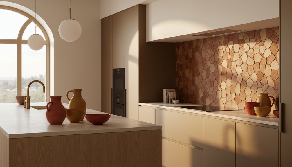
Warm terracotta and muddy ochres are settling into modern kitchens like an old wool blanket, bringing quiet depth to clean-lined spaces. You can use these earthy shades to soften pale cabinetry, cool stone, and polished metal without losing a contemporary edge. Start with tiles, pottery, or a painted island, then consider how wood, stone, and restrained neutrals shape the balance. The right finish can make the difference between timeless warmth and a colour that feels merely fashionable.
Key Takeaways
- Terracotta adds quiet, earthy warmth that softens modern cabinetry, stone worktops, and stainless-steel fixtures.
- Muddy ochre introduces a deeper, sunlit glow suited to heritage-inspired and country-style kitchen schemes.
- Begin with small accents, such as pottery, textiles, shelves, or stools, before committing to cabinetry or extensive tiling.
- Pair warm tones with cream, aged oak, muted sage, limestone, or honed stone to maintain balance and cohesion.
- Choose matte or low-sheen finishes, sample colors in changing daylight, and integrate them gradually for a natural, collected result.
Why Terracotta Works in Modern Kitchens
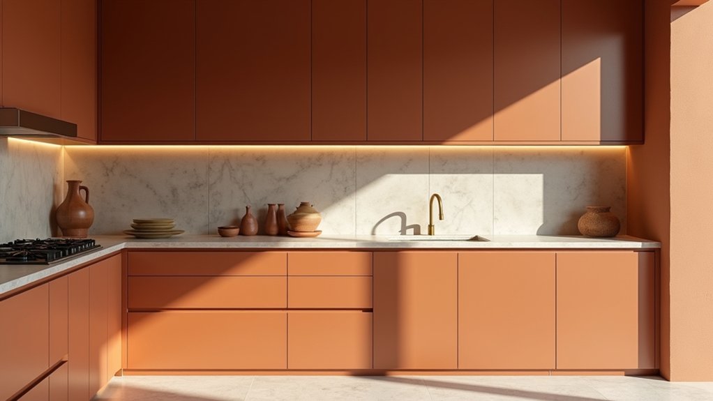
Terracotta works in modern kitchens because its earthy warmth softens streamlined cabinetry, stone surfaces, and stainless-steel fixtures without making the room feel overly rustic. You can use it through handmade tiles, a backsplash, pendant shades, or carefully chosen pottery.
Its gentle variation adds depth, while muted glazing keeps the finish composed rather than decorative. Terracotta also carries cultural symbolism, connecting your kitchen with ancient craft traditions, regional homes, and everyday cooking rituals. That heritage gives contemporary spaces a sense of permanence.
With proper sealing, terracotta resists everyday splashes, heat, and wear, demonstrating dependable material durability. You’ll find it especially useful where you want texture without visual clutter.
Pair it with timber, limewashed walls, or brushed metal, and you’ll create a kitchen that feels settled, useful, and quietly welcoming.
Terracotta or Ochre: Which Should You Choose?
Choose terracotta for warm earthiness that recalls old brick, clay pots, and worn tile.
Choose ochre when you want a deeper golden note with a little more light.
Let your worktops, joinery, and natural daylight guide the decision.
Terracotta’s Warm Earthiness
If you want a kitchen with quiet warmth and an aged, grounded feel, terracotta is the more enveloping choice. Its clay-based reds and softened browns bring an earthy calm that suits painted cabinetry, limestone, timber, and aged brass.
In color psychology, these muted, mineral notes can make a room feel settled and welcoming without demanding attention. Terracotta also carries historical significance: you’ll find related tones in traditional tiles, earthenware, and plaster across Mediterranean and rural interiors.
Use it on a backsplash, a range wall, or an island base when you want character with restraint. Test samples beside your worktops, since terracotta can shift noticeably in changing light.
Choose a chalky, weathered finish for heritage appeal, and balance it with quieter natural materials to keep the kitchen timeless.
Ochre’s Golden Depth
Where terracotta brings softened clay warmth, ochre adds a deeper golden note with a hint of aged pigment. Choose it when you want your kitchen to feel sunlit, grounded, and quietly distinctive.
Its muted richness suits painted cabinetry, limewashed walls, aged brass, and dark timber, especially where natural light changes throughout the day.
Ochre carries historical significance, appearing in ancient cave paintings, traditional plasters, and rural interiors across Europe and beyond. That cultural symbolism gives the shade a lived-in quality rather than a newly manufactured brightness.
You’ll find it particularly effective on an island, pantry doors, or a single accent wall, where its depth can settle the room without overwhelming it. If your scheme already includes warm stone or weathered wood, ochre will deepen the palette with an enduring, heritage-minded glow.
Add Warm Color Through Cabinets and Tile
You can bring warmth in through cabinetry finished in muted ochre, clay, or tobacco tones. Use terracotta tiles sparingly—behind the range, along a backsplash, or on the floor—to give the kitchen a timeworn character.
Keep surrounding finishes simple so these enduring colors feel considered rather than heavy.
Warm-Toned Cabinetry
Warm-toned cabinetry offers one of the simplest ways to bring terracotta and muddy ochre into a kitchen without making the room feel overly styled. Choose a muted clay, tobacco, or faded sienna finish rather than a bright orange-red. These shades lend Vintage charm, especially on simple Shaker doors, framed fronts, or painted timber with visible grain.
Let color psychology guide your choice: earthy reds can make the room feel settled and sociable, while ochre adds quiet warmth without demanding attention. Balance deeper cabinets with pale stone, aged brass, or softly painted walls.
A low-sheen finish usually looks more natural than high gloss and wears gracefully over time. If you’re unsure, sample the color beside your worktop and observe it in morning and evening light.
Terracotta Tile Accents
Terracotta tiles can add depth and warmth without replacing the restraint of painted cabinetry. Use them as a backsplash, pantry floor, or narrow border behind open shelving.
Their earthy variation softens crisp joinery and makes a new kitchen feel settled, especially beside cream, olive, or muted blue paint. Choose handmade or subtly irregular tiles if you want character, but keep the layout simple so the surface doesn’t overwhelm the room.
Consider sealing porous terracotta, and order samples before committing; tones can shift noticeably in changing light.
Cultural influences often shape terracotta’s appeal, from Mediterranean courtyards to English utility rooms, while its historical significance gives even a modest accent a sense of continuity.
You’ll create warmth through material, not decoration, and preserve the calm, practical character of the cabinetry.
Pair Earthy Hues With Wood and Stone
Pairing earthy hues with wood and stone gives a kitchen a grounded, heritage-inspired character without making it feel dated. Let terracotta cabinetry or a muddy ochre wall bring warmth to timber shelves, oak doors, or a butcher-block island. The grain softens the colour’s weight, while natural stone adds lasting texture and quiet variation.
Choose limestone, soapstone, or honed granite for worktops and splashbacks; their gentle markings complement natural clay tones without competing for attention. You can echo those shades in a wooden stool, woven basket, or aged chopping board, creating a considered link between surfaces.
Keep finishes tactile rather than glossy, so the room retains rustic charm and feels collected over time. A few well-made materials will give your kitchen depth, character, and practical durability.
Balance Warm Colors With Neutrals
If terracotta or muddy ochre feels dominant, balance it with quiet neutrals that let the warmth settle. Choose chalky white, softened cream, or pale mushroom for walls and larger surfaces, giving your kitchen a calm, timeworn foundation. These shades won’t compete with earthy color; they’ll make it feel considered rather than heavy.
Use Color psychology to guide the mood: warm ivory feels welcoming, while cool stone gray adds gentle restraint. For effective neutral pairing, repeat one neutral across adjoining areas, then introduce a second in smaller amounts to create depth. Keep the contrast modest, as a heritage kitchen rarely relies on stark divisions.
You’ll find that linen, faded canvas, and old plaster tones soften strong pigment without erasing its character. Let the neutrals frame the warmth, not flatten it.
Choose Finishes That Suit Your Kitchen
Choose finishes that support the kitchen’s warmth without making it feel overly polished. Choose honed stone, aged brass, and softly grained timber to give terracotta and muddy ochre a grounded, lived-in character.
A matte backsplash reduces glare, while lightly textured plaster or handmade tile adds quiet depth without demanding attention. Consider how each surface handles daily use: sealed stone resists stains, durable paint tolerates splashes, and brushed hardware hides fingerprints better than mirror-polished metal.
Color psychology matters here; warmer, muted finishes can make a busy kitchen feel settled and welcoming. Look to historical influences, too, from farmhouse flagstones to painted cupboards and worn copper.
Let the room’s architecture guide you, matching finish weight and texture to existing beams, floors, or masonry. You’ll create a kitchen that feels collected rather than newly manufactured.
Test Terracotta and Ochre With Small Accents
Start with small accents before committing to terracotta or muddy ochre across larger surfaces. Try a glazed jug, linen tea towel, wooden stool, or set of painted shelves, then watch how each shade behaves in your kitchen’s natural light. These modest additions let you judge warmth without disturbing established cabinetry or worktops.
Use Color mixing thoughtfully: pair terracotta with softened cream, aged oak, or muted sage rather than introducing several strong tones at once. Muddy ochre sits comfortably beside stone, putty, and dark ironwork, recalling well-used country kitchens.
Pay attention to Accent placement. Set warmer pieces near windows, open shelving, or a plain wall where they can add depth without dominating. Live with the accents for several weeks. If they feel settled, extend the colour gradually through tiles, curtains, or painted furniture.
Frequently Asked Questions
Can Terracotta and Ochre Kitchen Colors Affect Perceived Room Temperature?
Yes, terracotta and ochre can make your kitchen feel warmer, though they don’t change its temperature. Color psychology and cultural associations encourage comfort; balance these earthy shades with pale surfaces and practical, heritage-inspired lighting.
How Do Terracotta and Ochre Perform in Kitchens With Limited Natural Light?
Limited light makes terracotta and ochre kitchens feel warmer, but dark shades can overwhelm. Choose terra cotta accents, pale ochre backsplash ideas, reflective finishes, and balanced lighting to preserve brightness and heritage character.
Are Terracotta and Ochre Kitchen Colors Suitable for Resale-Focused Renovations?
Yes, you can use terracotta and ochre for resale, especially as accents. Respect Historical design trends and the Cultural significance of earthy tones, but balance them with neutral cabinetry, durable finishes, and broadly appealing fixtures.
How Can You Repair Chips or Scratches in Terracotta-Colored Cabinetry?
You can repair small chips and scratches with Terracotta finish maintenance: clean, lightly sand, then apply matching touch-up paint. Scratch repair techniques work best when you test color first and seal repaired areas discreetly.
Do Terracotta and Ochre Finishes Require Specialized Cleaning Products?
You don’t need specialized cleaners for terracotta or ochre finishes. Use gentle Cleaning techniques: warm water, mild soap, and a soft cloth. Follow product recommendations, avoid abrasives, and dry surfaces promptly to preserve their quiet, timeworn character.